pacman::p_load(ggplot2,lubridate,ggrepel, patchwork,
               ggthemes, hrbrthemes,
               tidyverse)

options(readr.show_col_types = FALSE)
options(warn=-1)

setwd("./data/Take-home_Ex01/data")
full_data <-  list.files(
                    pattern = "*.csv",
                    full.names=T) %>%
                    lapply(read_csv) %>%
                    bind_rows()


cleaned_data <- full_data %>%
  mutate(across(c(`Nett Price($)`, `Area (SQM)`, `Unit Price ($ PSM)`), ~replace(., . == "" | . == "-", NA))) %>%
  mutate(
    `Transacted Price ($)` = as.numeric(gsub(",", "", `Transacted Price ($)`)),
    `Area (SQFT)` = as.numeric(`Area (SQFT)`),
    `Unit Price ($ PSF)` = as.numeric(gsub(",", "", `Unit Price ($ PSF)`)),
    `Sale Date` = dmy(`Sale Date`),
    `Area (SQM)` = as.numeric(`Area (SQM)`),
    `Unit Price ($ PSM)` = as.numeric(gsub(",", "", `Unit Price ($ PSM)`)),
    `Nett Price($)` = ifelse(is.na(`Nett Price($)`),
                             `Area (SQM)` * `Unit Price ($ PSM)`,
                             as.numeric(gsub(",", "", `Nett Price($)`)))
)Take Home Assignment 2
Introduction
In this take-home exercise, we are required to:
select one data visualisation from the Take-home Exercise 1 submission prepared by your classmate,
critic the submission in terms of clarity and aesthetics,
prepare a sketch for the alternative design by using the data visualisation design principles and best practices you had learned in Lesson 1 and 2.
remake the original design by using ggplot2, ggplot2 extensions and tidyverse packages.
For this assignment, I selected Keke’s assignment 1 visualization 1 for evaluation. https://isss608keke.netlify.app/takehome/takehome1
Reproduce visualization
The data preparation process is exactly the same as Keke’s original implementation.
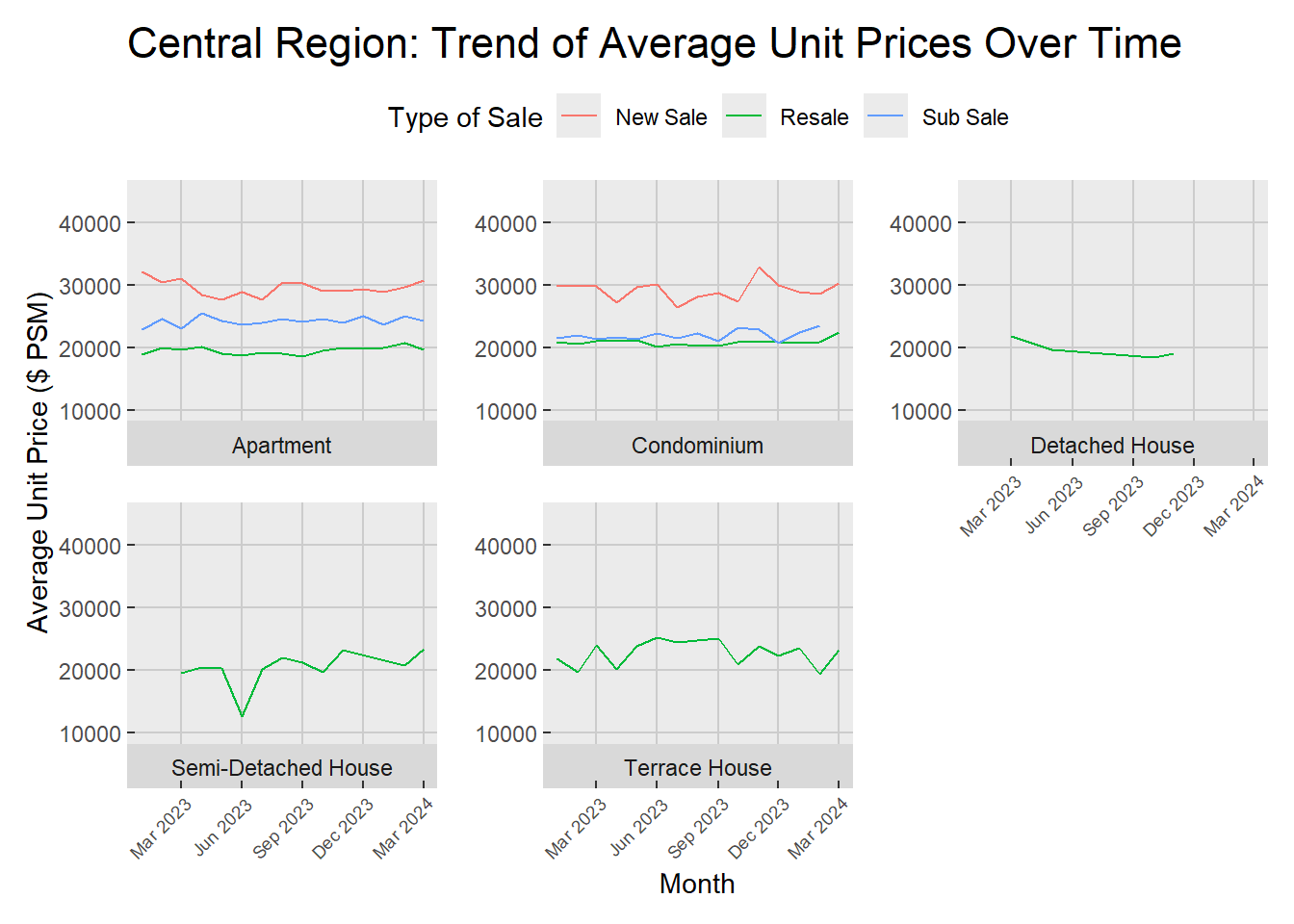
Reproduce visualization for central region:
p1 <- cleaned_data %>%
  filter(`Planning Region` == "Central Region") %>%
  group_by(Month = floor_date(`Sale Date`, "month"), `Type of Sale`, `Property Type`) %>%
  summarize(Average_Price = mean(`Unit Price ($ PSM)`, na.rm = TRUE), .groups = 'drop') %>%
  ggplot(aes(x = Month, y = Average_Price, color = `Type of Sale`)) +
  geom_line() +
  scale_x_date(date_breaks = "3 month", date_labels = "%b %Y") +
  labs(
    title = "Central Region: Trend of Average Unit Prices Over Time",
    x = "Month",
    y = "Average Unit Price ($ PSM)"
  ) +
  facet_wrap(~ `Property Type`, scales = "free_y", strip.position = "bottom") +
  theme(
    plot.title = element_text(size = rel(1.5)),
    legend.position = "top",
    legend.text = element_text(size = rel(0.8)),
    panel.grid.major = element_line(color = "grey80"),
    panel.grid.minor = element_blank(),
    plot.margin = margin(10, 10, 10, 10),
    strip.text = element_text(size = rel(0.8)),  # adjust strip text size
    axis.text.x = element_text(size = rel(0.8), angle = 45, hjust = 1, vjust = 1),  # adjust x-axis text size
    axis.ticks.length = unit(-3, "pt"),  #aAdjust tick length
    panel.spacing = unit(1, "lines")  # adjust spacing between facets
  )

p1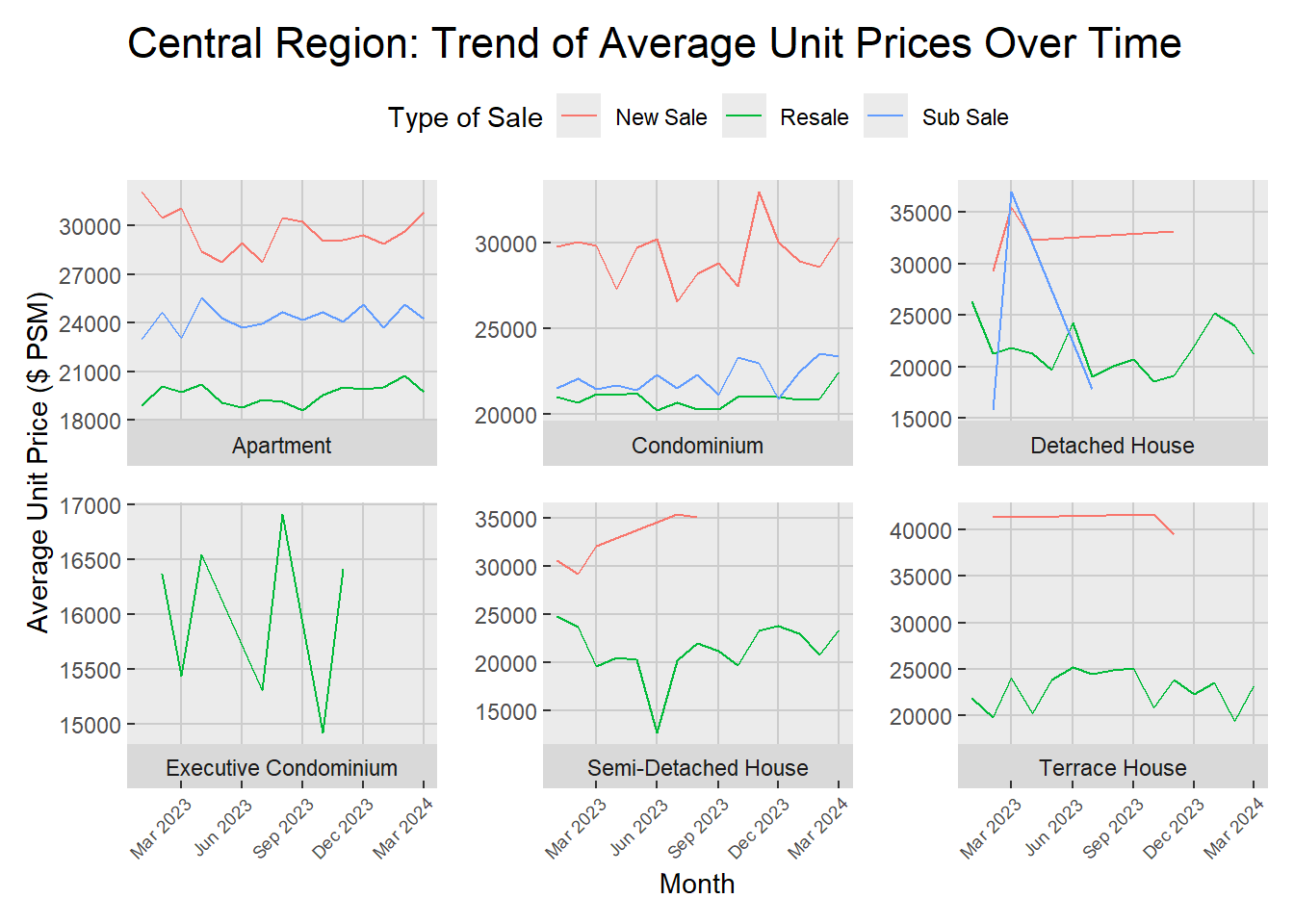
Critics
Original write-up from Keke:
In the Central Region, Q1 2024 presents a stable pricing pattern for apartments, condominiums, and terrace houses, mirroring trends from the previous year. Conversely, detached houses experienced a significant rise in prices, followed by a pronounced dip, particularly within the sub-sale segment, which has now narrowed down to only resale transactions. It shows there was flutuation under Executive condominiums from March to December 2023, culminating in a complete absence of new sales in the subsequent quarter. Meanwhile, semi-detached houses witnessed a singular decline in June 2023, after which prices entered a gradual and steady climb, indicating a stabilizing market as progress through 2024.
Critics:
- Regarding the statement “detached houses experienced a significant rise in prices, followed by a pronounced dip, particularly within the sub-sale segment”, this can be clearly observed from the graph. However, it is worth noticing that the sale number of detached houses is quite low in the sub-sale market (21 for the whole year as shown below). The sales volume is insufficient to accurately depict the sales trend.
sub_sale_detach <- cleaned_data %>%
  filter(`Planning Region` == "Central Region" & `Property Type` == "Detached Houses" & `Type of Sale` == "Sub Sale")
length(sub_sale_detach)
[1] 21A better approach might be remove the monthly plot based on some conditions, e.g. remove if sale of current month is less than 10.
p2 <- cleaned_data %>%
  filter(`Planning Region` == "Central Region") %>%
  group_by(Month = floor_date(`Sale Date`, "month"), `Type of Sale`, `Property Type`) %>%
  filter(n() >= 10) %>%
  summarize(Average_Price = mean(`Unit Price ($ PSM)`, na.rm = TRUE), .groups = 'drop') %>%
  ggplot(aes(x = Month, y = Average_Price, color = `Type of Sale`)) +
  geom_line() +
  ylim(10000,45000) +
  scale_x_date(date_breaks = "3 month", date_labels = "%b %Y") +
  labs(
    title = "Central Region: Trend of Average Unit Prices Over Time",
    x = "Month",
    y = "Average Unit Price ($ PSM)"
  ) +
  facet_wrap(~ `Property Type`, scales = "free_y", strip.position = "bottom") +
  theme(
    plot.title = element_text(size = rel(1.5)),
    legend.position = "top",
    legend.text = element_text(size = rel(0.8)),
    panel.grid.major = element_line(color = "grey80"),
    panel.grid.minor = element_blank(),
    plot.margin = margin(10, 10, 10, 10),
    strip.text = element_text(size = rel(0.8)),  # adjust strip text size
    axis.text.x = element_text(size = rel(0.8), angle = 45, hjust = 1, vjust = 1),  # adjust x-axis text size
    axis.ticks.length = unit(-3, "pt"),  #aAdjust tick length
    panel.spacing = unit(1, "lines")  # adjust spacing between facets
  )

p2
- Regarding the highlight of the fluctuation under executive condominiums compared to other property types, it is rather misleading. The graphs for different properties do not share the same y-axis scales. Highlighting fluctuations with a smaller scale can mislead users. A better visualization should have consistent scales across different property types.
p2 <- cleaned_data %>%
  filter(`Planning Region` == "Central Region") %>%
  group_by(Month = floor_date(`Sale Date`, "month"), `Type of Sale`, `Property Type`) %>%
  summarize(Average_Price = mean(`Unit Price ($ PSM)`, na.rm = TRUE), .groups = 'drop') %>%
  ggplot(aes(x = Month, y = Average_Price, color = `Type of Sale`)) +
  geom_line() +
  ylim(10000,45000) +
  scale_x_date(date_breaks = "3 month", date_labels = "%b %Y") +
  labs(
    title = "Central Region: Trend of Average Unit Prices Over Time",
    x = "Month",
    y = "Average Unit Price ($ PSM)"
  ) +
  facet_wrap(~ `Property Type`, scales = "free_y", strip.position = "bottom") +
  theme(
    plot.title = element_text(size = rel(1.5)),
    legend.position = "top",
    legend.text = element_text(size = rel(0.8)),
    panel.grid.major = element_line(color = "grey80"),
    panel.grid.minor = element_blank(),
    plot.margin = margin(10, 10, 10, 10),
    strip.text = element_text(size = rel(0.8)),  # adjust strip text size
    axis.text.x = element_text(size = rel(0.8), angle = 45, hjust = 1, vjust = 1),  # adjust x-axis text size
    axis.ticks.length = unit(-3, "pt"),  #aAdjust tick length
    panel.spacing = unit(1, "lines")  # adjust spacing between facets
  )

p2
Conclusion
By combining critic 1 and 2, a more impartial visualization could be created.
p2 <- cleaned_data %>%
  filter(`Planning Region` == "Central Region") %>%
  group_by(Month = floor_date(`Sale Date`, "month"), `Type of Sale`, `Property Type`) %>%
  filter(n() >= 10) %>%
  summarize(Average_Price = mean(`Unit Price ($ PSM)`, na.rm = TRUE), .groups = 'drop') %>%
  ggplot(aes(x = Month, y = Average_Price, color = `Type of Sale`)) +
  geom_line() +
  ylim(10000,45000) +
  scale_x_date(date_breaks = "3 month", date_labels = "%b %Y") +
  labs(
    title = "Central Region: Trend of Average Unit Prices Over Time",
    x = "Month",
    y = "Average Unit Price ($ PSM)"
  ) +
  facet_wrap(~ `Property Type`, scales = "free_y", strip.position = "bottom") +
  theme(
    plot.title = element_text(size = rel(1.5)),
    legend.position = "top",
    legend.text = element_text(size = rel(0.8)),
    panel.grid.major = element_line(color = "grey80"),
    panel.grid.minor = element_blank(),
    plot.margin = margin(10, 10, 10, 10),
    strip.text = element_text(size = rel(0.8)),  # adjust strip text size
    axis.text.x = element_text(size = rel(0.8), angle = 45, hjust = 1, vjust = 1),  # adjust x-axis text size
    axis.ticks.length = unit(-3, "pt"),  #aAdjust tick length
    panel.spacing = unit(1, "lines")  # adjust spacing between facets
  )

p2