options(warn=-1)
pacman::p_load(tidyverse)Hands-on 1
exam_data <- read_csv("../data/Exam_data.csv")Rows: 322 Columns: 7
── Column specification ────────────────────────────────────────────────────────
Delimiter: ","
chr (4): ID, CLASS, GENDER, RACE
dbl (3): ENGLISH, MATHS, SCIENCE
ℹ Use `spec()` to retrieve the full column specification for this data.
ℹ Specify the column types or set `show_col_types = FALSE` to quiet this message.hist(exam_data$MATHS)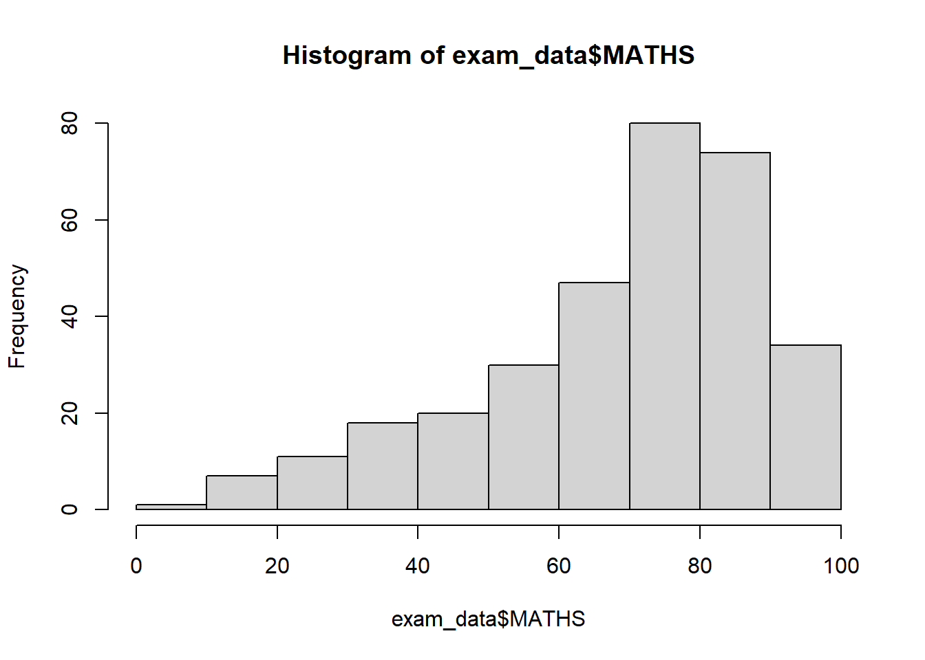
ggplot(data=exam_data, aes(x = MATHS)) + geom_histogram(bins=10, boundary = 100, color="black", fill="grey") + ggtitle("Distribution of Maths scores")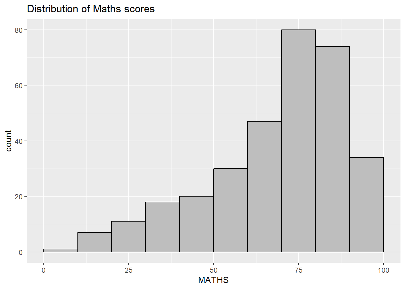
ggplot(data=exam_data,
       aes(x=RACE)) +
  geom_bar()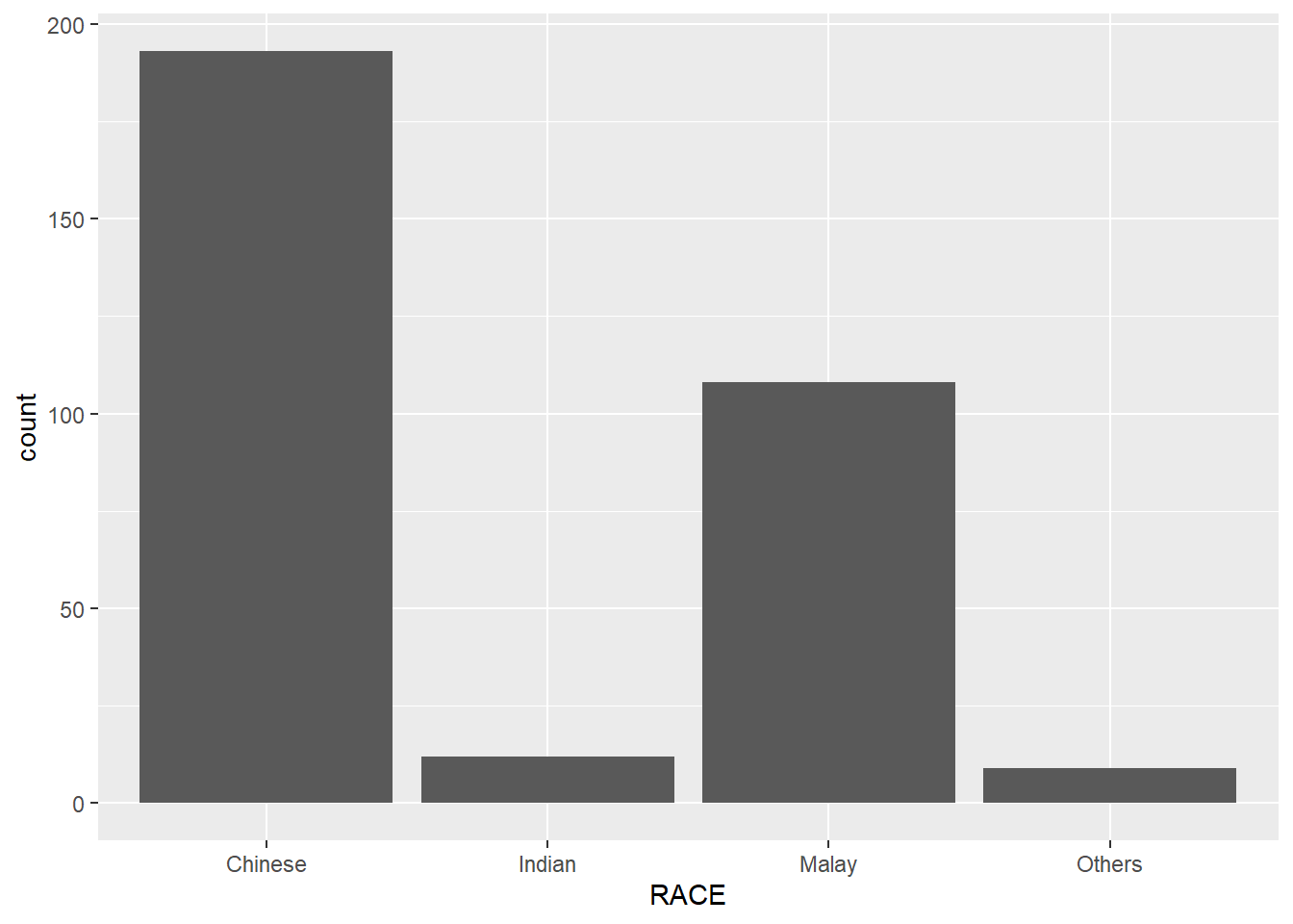
ggplot(data=exam_data,
       aes(x = MATHS)) +
  geom_dotplot(dotsize = 0.5)
Bin width defaults to 1/30 of the range of the data. Pick better value with
`binwidth`.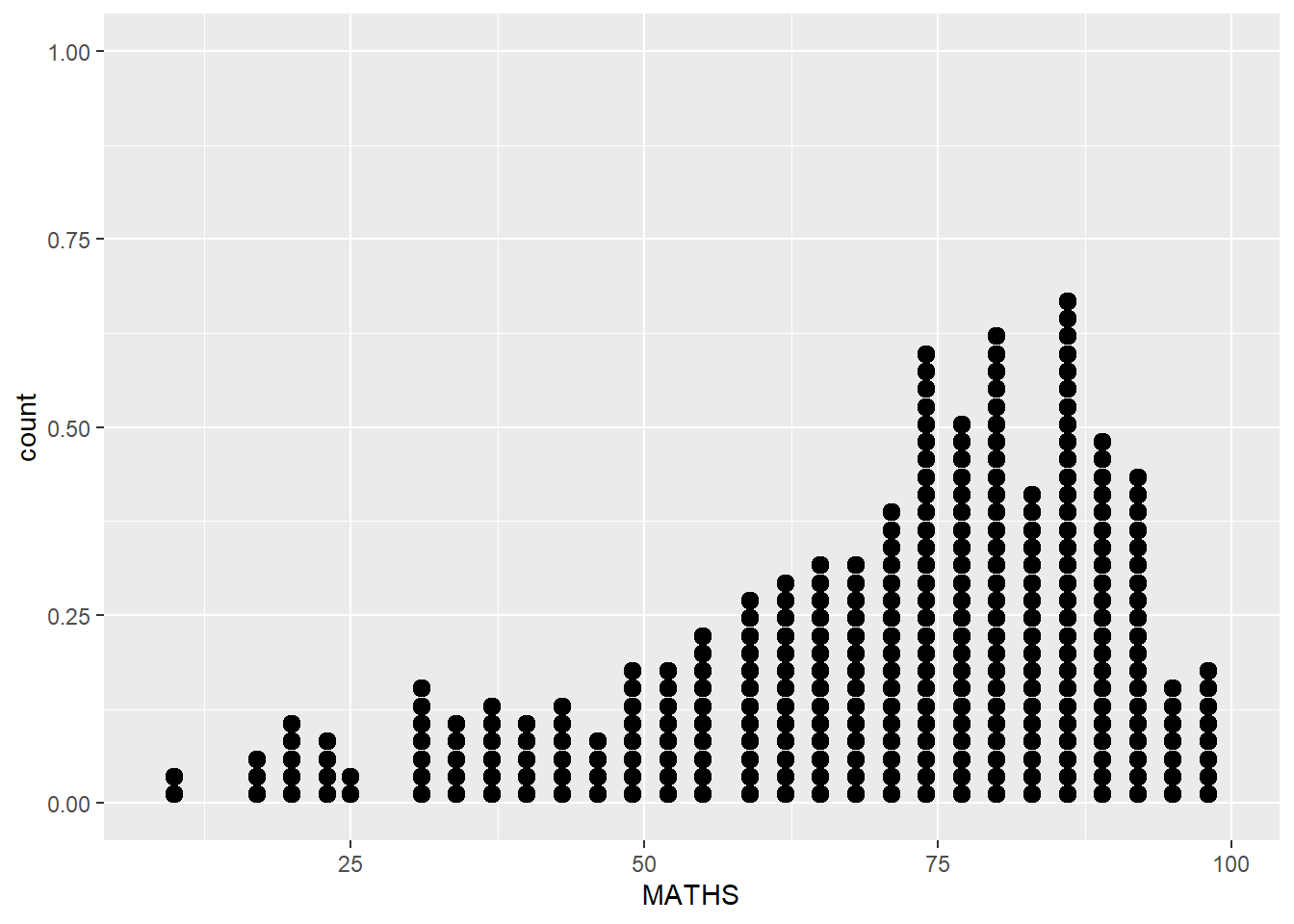
ggplot(data=exam_data,
       aes(x = MATHS)) +
  geom_dotplot(binwidth=2.5,
               dotsize = 0.5) +
  scale_y_continuous(NULL,
breaks = NULL) 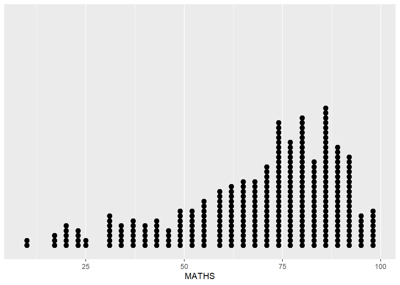
ggplot(data=exam_data,
       aes(x = MATHS)) +
  geom_histogram()
`stat_bin()` using `bins = 30`. Pick better value with `binwidth`.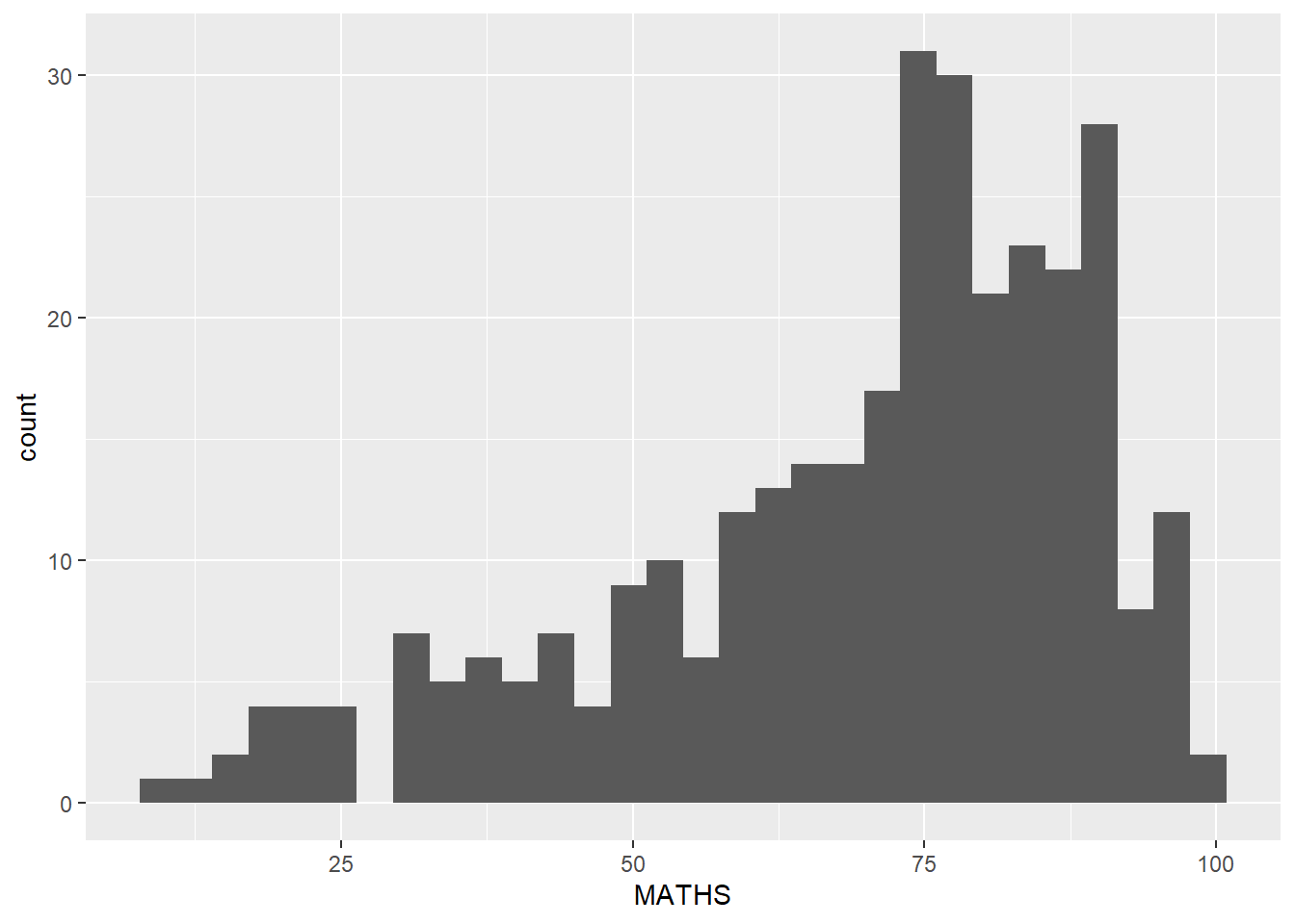
ggplot(data=exam_data,
       aes(x= MATHS)) +
  geom_histogram(bins=20,
                 color="black",
fill="light blue") 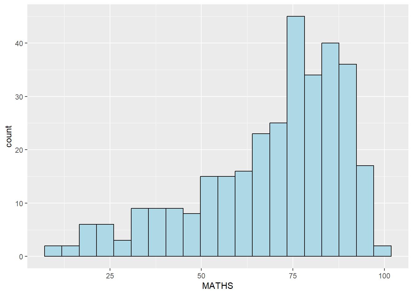
ggplot(data=exam_data,
       aes(x= MATHS,
           fill = GENDER)) +
  geom_histogram(bins=20,
                 color="grey30")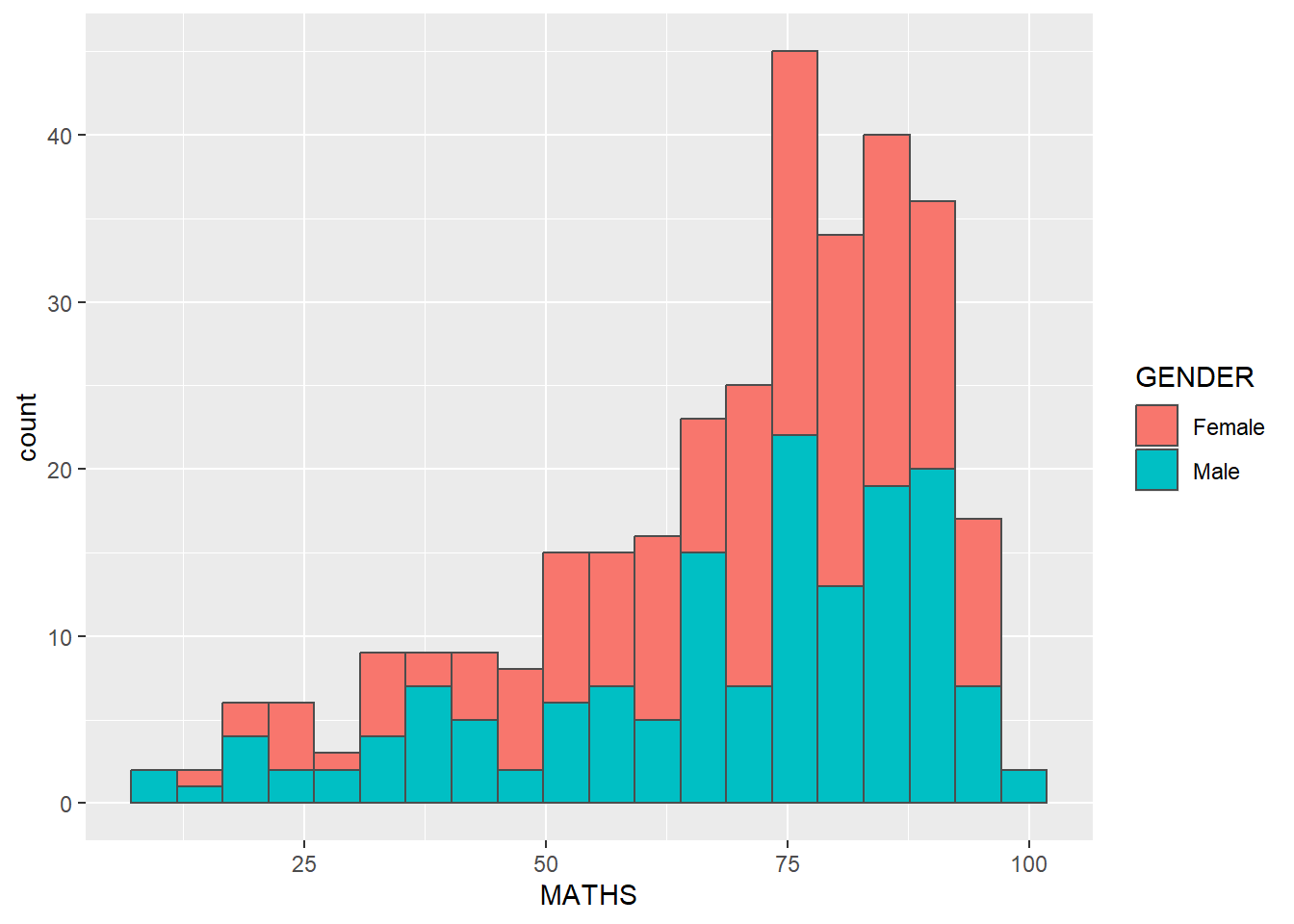
ggplot(data=exam_data,
       aes(x = MATHS)) +
geom_density() 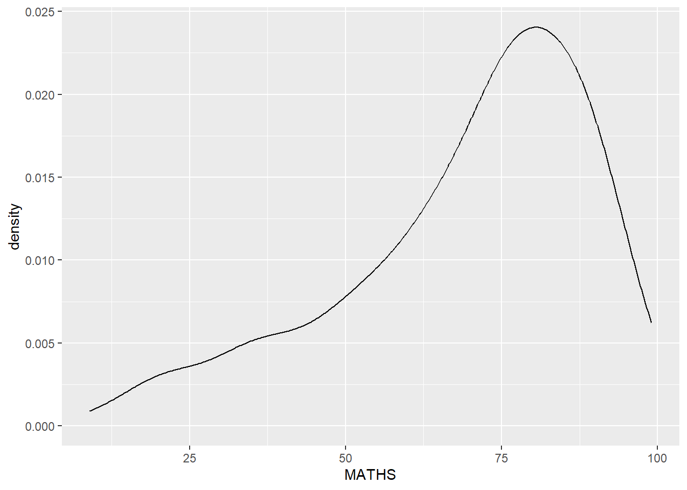
ggplot(data=exam_data,
       aes(x = MATHS,
           colour = GENDER)) +
  geom_density()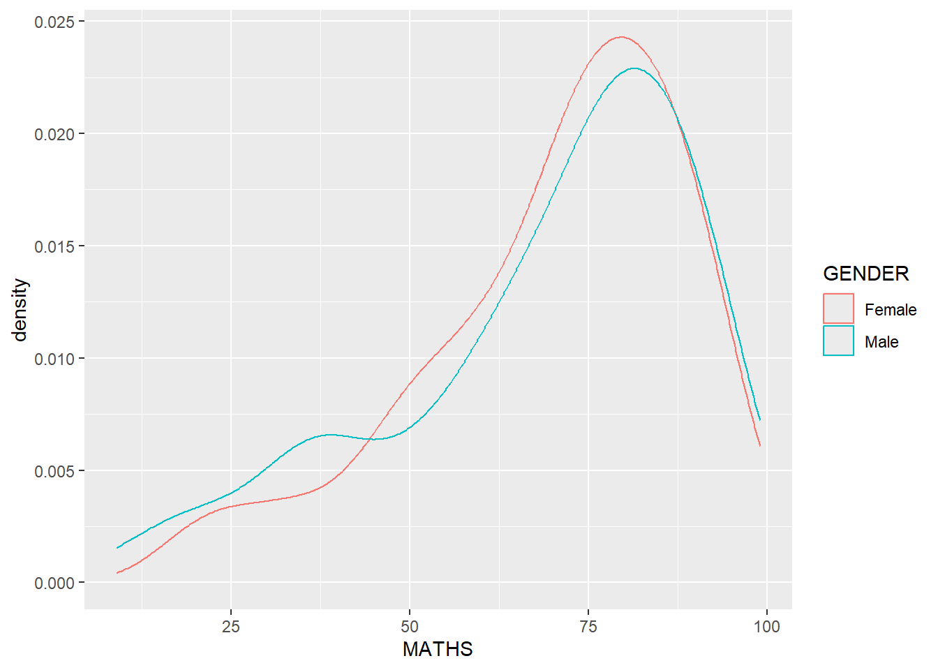
ggplot(data=exam_data,
       aes(y = MATHS,
           x= GENDER)) +
geom_boxplot() 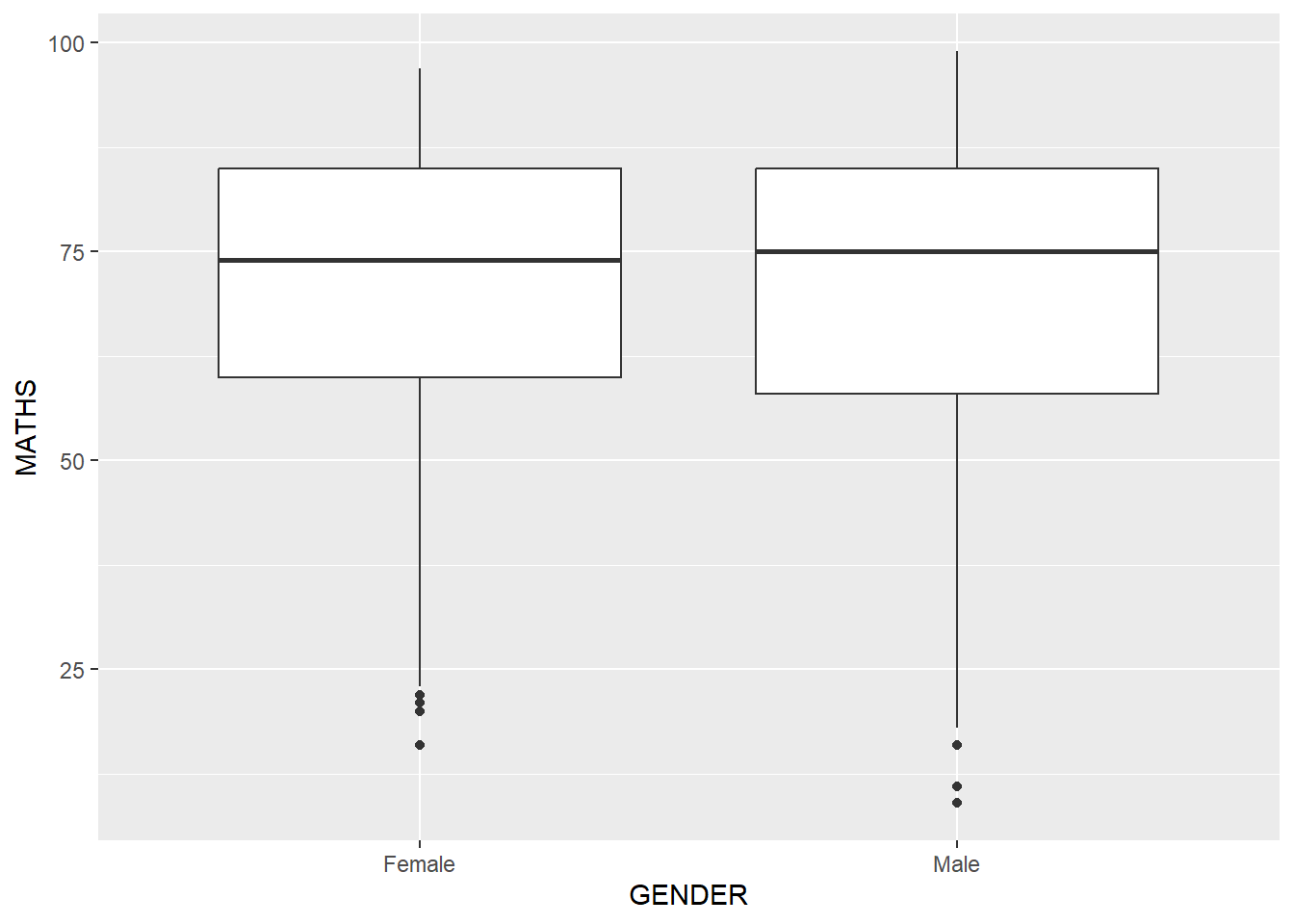
ggplot(data=exam_data,
       aes(y = MATHS, x= GENDER)) +
  geom_boxplot() +
  stat_summary(geom = "point",
               fun.y="mean",
               colour ="red",
size=4) 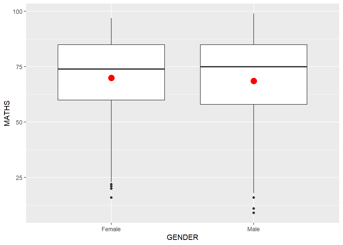
ggplot(data=exam_data,
       aes(x= MATHS, y=ENGLISH)) +
  geom_point() +
  geom_smooth(size=0.5)
`geom_smooth()` using method = 'loess' and formula = 'y ~ x'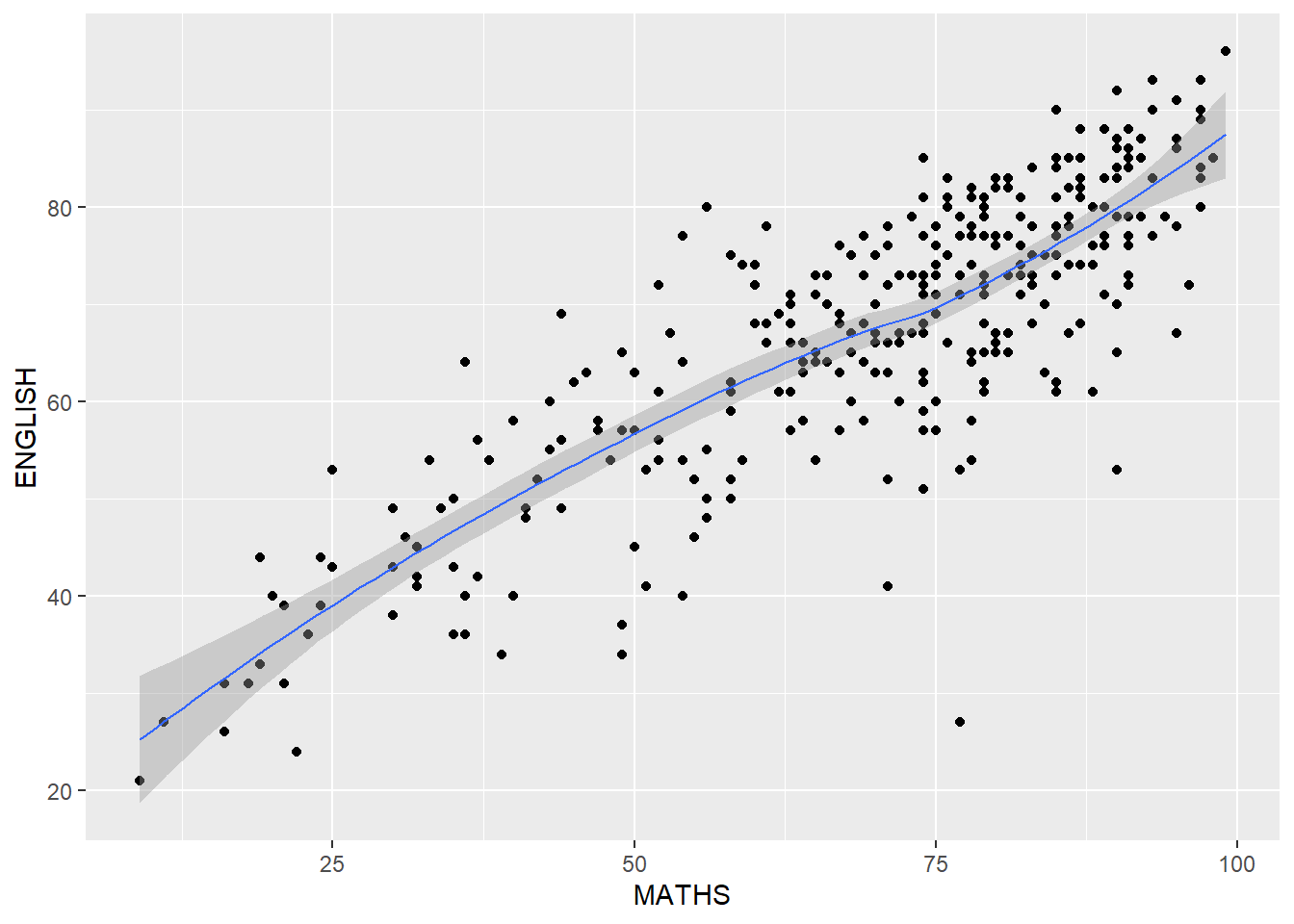
ggplot(data=exam_data,
       aes(x= MATHS,
           y=ENGLISH)) +
  geom_point() +
  geom_smooth(method=lm,
              size=0.5)
`geom_smooth()` using formula = 'y ~ x'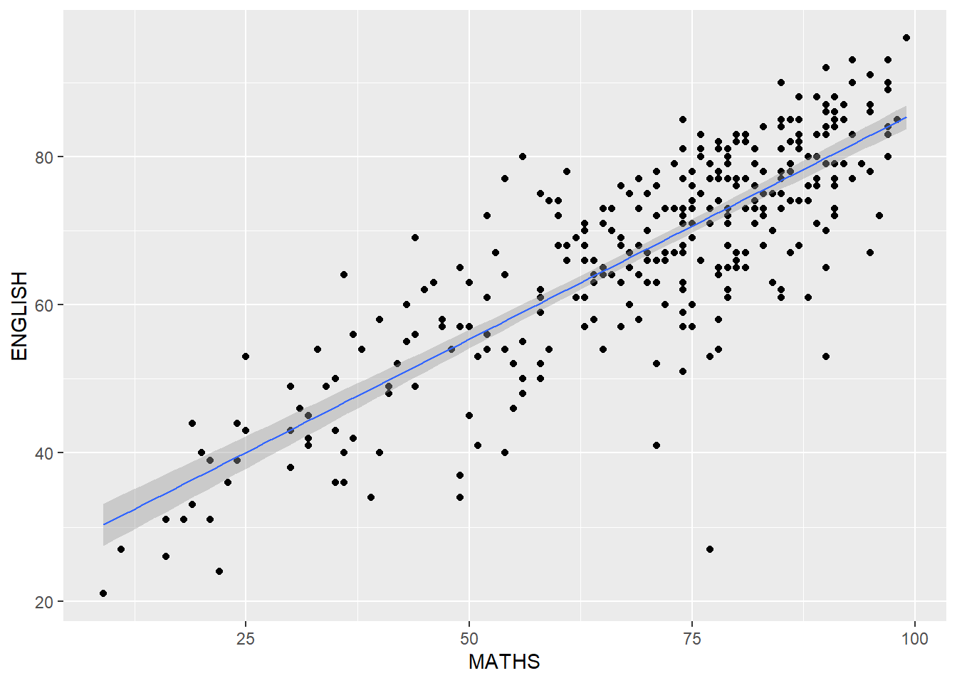
ggplot(data=exam_data,
       aes(x= MATHS, y=ENGLISH)) +
  geom_point() +
  geom_smooth(method=lm,
              size=0.5) +
  coord_cartesian(xlim=c(0,100),
                  ylim=c(0,100))
`geom_smooth()` using formula = 'y ~ x'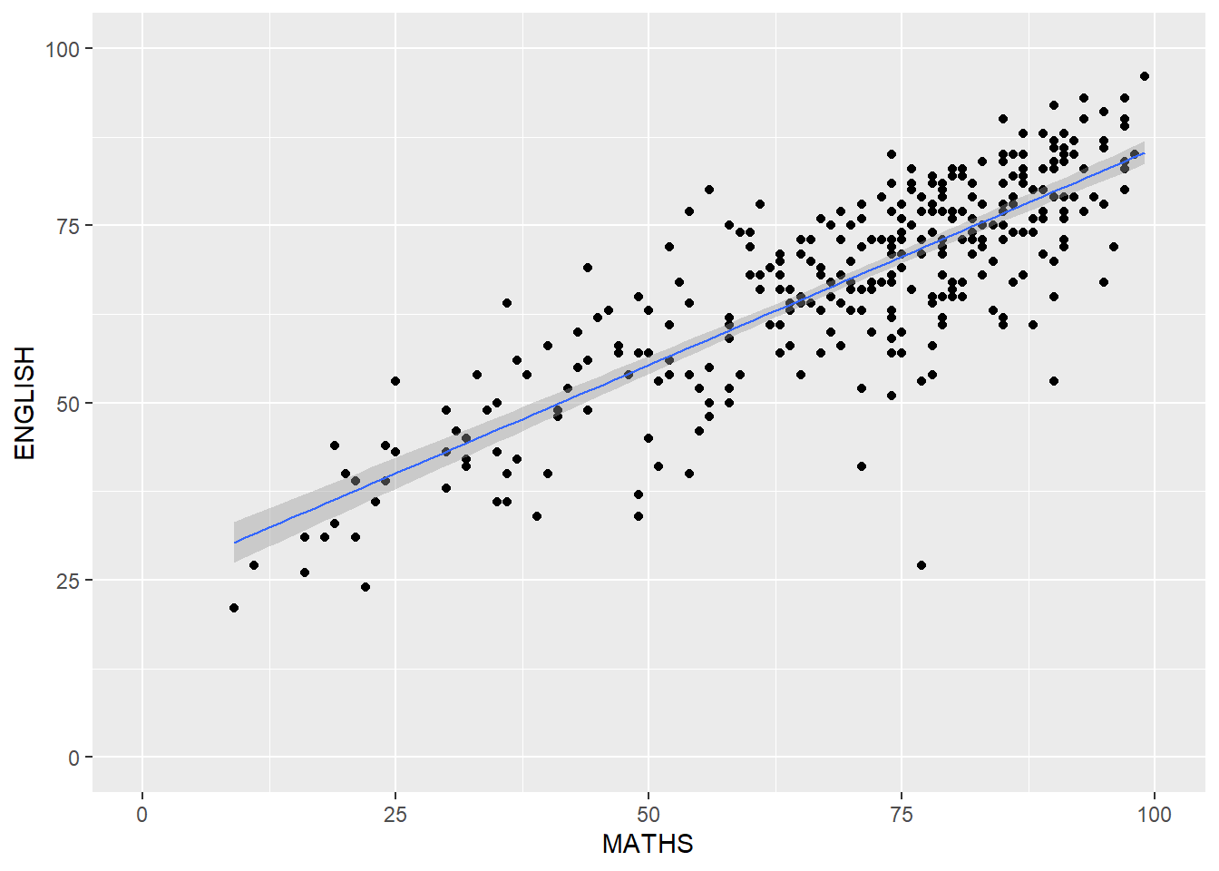
ggplot(data=exam_data,
       aes(x= MATHS)) +
  geom_histogram(bins=20) +
    facet_wrap(~ CLASS)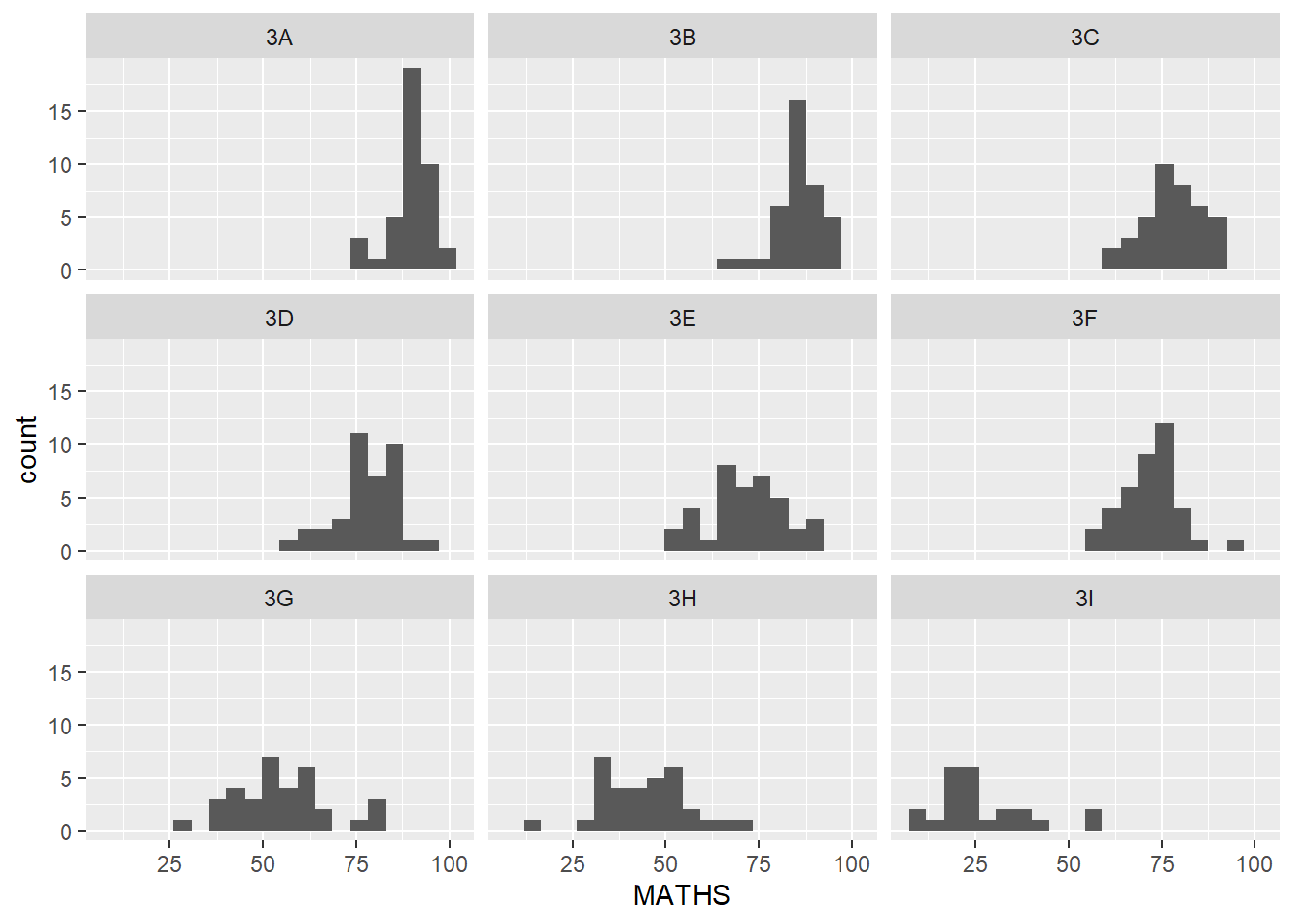
ggplot(data=exam_data,
       aes(x= MATHS)) +
  geom_histogram(bins=20) +
    facet_grid(~ CLASS)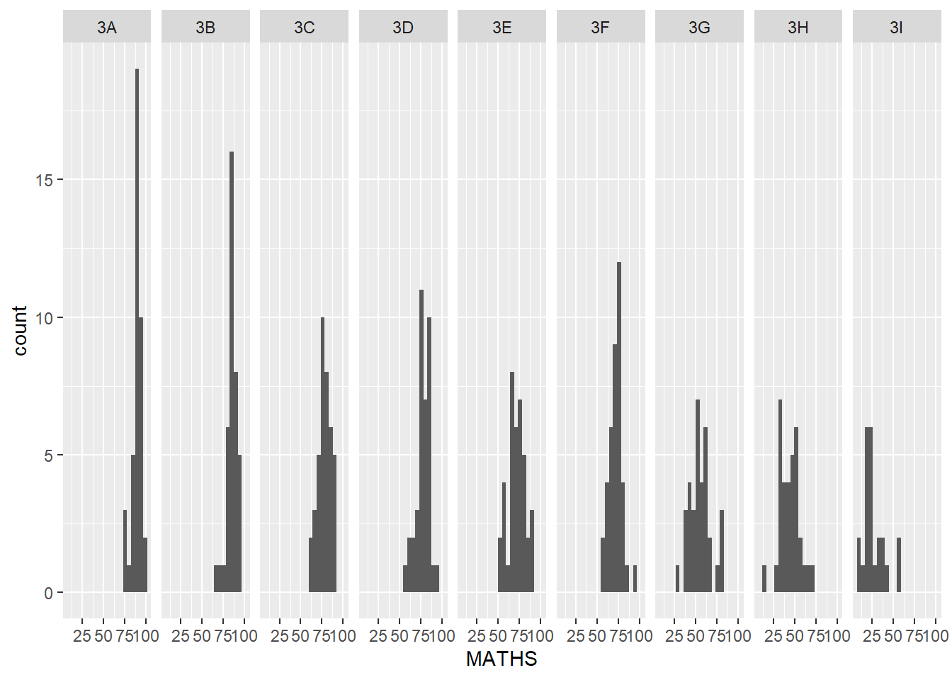
ggplot(data=exam_data,
       aes(x=RACE)) +
  geom_bar()
ggplot(data=exam_data,
       aes(x=RACE)) +
  geom_bar() +
  coord_flip()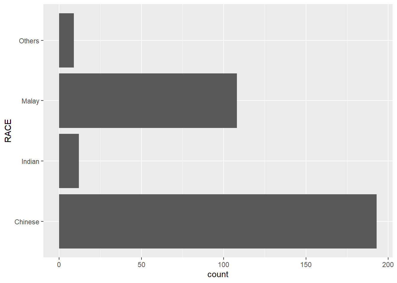
ggplot(data=exam_data,
       aes(x=RACE)) +
  geom_bar() +
  coord_flip() +
  theme_classic()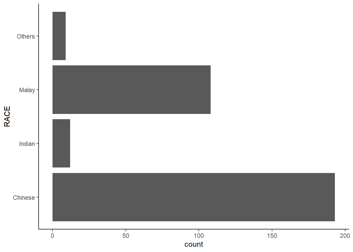
ggplot(data=exam_data,
       aes(x=RACE)) +
  geom_bar() +
  coord_flip() +
  theme_minimal()
Reflections:
It’s a very good introduction to explore various visualization techniques, such as barchart, scatterplot, etc.